On Spectrogram Settings
Today’s post is the promised follow-up to my post on the history of spectrograms. I want to explain some basic concepts of spectrographic analysis so that I can clear up some common misconceptions and explain why some things may not always look quite the way you expected.
In “A Brief History of Spectrograms” I mentioned that the original Kay Electric Co. Sona-Graph had two settings: narrow-band and wide-band. Nowadays, spectrograms are produced from digital recordings on computer software that allows much more control over the width of the “band.” But our control over how spectrograms look isn’t complete, and here’s why.
The Trade-off: Frequency Resolution vs. Time Resolution
The first thing every student of spectrograms should understand is that the more accurately you measure the frequency of a sound, the less accurately you can know when it begins and ends – and vice versa. The reason for this is a fundamental part of the mathematics behind our spectrographic analysis, and I won’t attempt to explain it here.
The main effect of this principle is that modern spectrograms are broken up into small rectangles called “windows” which are the basic “pixels” of the image. As anyone familar with digital images knows, tiny pixels make for a sharp, clear image, and big pixels make for a blocky, poorly defined image. Unfortunately, spectrographic windows are necessarily rather big and blocky. You can shorten them in one dimension, but if you do, they automatically get longer in the other dimension. Depending on your settings, you can end up with “pixels” that are long, thin rectangles, instead of squares.
Modern spectrographic analysis software generates these “windows” behind the scenes and then automatically “smooths” the resulting spectrograms so that they seem to have higher resolution than they actually do. This smoothing algorithm is basically an after-the-fact Photoshop trick, and although it’s very helpful in making visual sense of a spectrogram, it’s important to realize that the smoothing doesn’t actually increase the amount of information in the spectrogram; it’s just the computer’s best guess at what the spectrogram would look like if the resolution were higher.
Here’s a series of spectrograms of the exact same recording (an American Tree Sparrow call). On the left is the raw, unsmoothed spectrogram. On the right is the smoothed version. From top to bottom, the time resolution increases and the the frequency resolution decreases.
Window size: 23.2 mS × 61.9 Hz
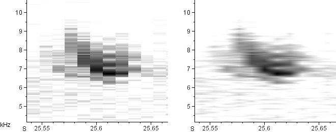
Window size: 11.6 mS × 124 Hz
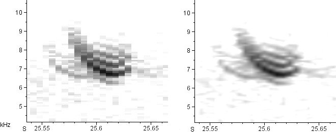
Window size: 5.8 mS × 248 Hz
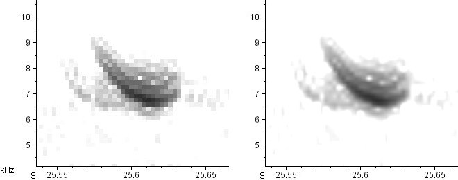
Window size: 2.9 mS × 496 Hz
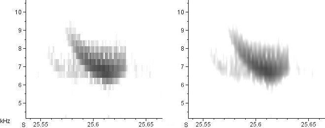
Window size: 1.45 mS × 991 Hz
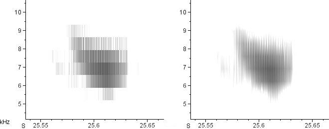
Note that I am not “zooming” in or out on these calls; the time and frequency axes remain precisely the same in all of the above spectrograms. All I’ve done is decrease the width of the analysis windows, which automatically increases their height.
See how tremendously different the smoothed spectrograms look from one another? The difference between the second and fifth is particularly striking. In the second, we clearly see a series of horizontal sidebands in the call. In the fifth, we see only an extremely rapid series of vertical, click-like notes. How can these possibly be spectrograms of the same call? Which one is right?
They’re both right. All the spectrograms above are accurate, in that they’re all displaying different (accurate) interpretations of the same data. A complex tone comprised of whistled partials (like in the second spectrogram) and a rapid series of clicks (like in the fifth spectrogram) can be the same sound. Once a series of clicks becomes fast enough, we hear it as a harmonically complex tone. This shouldn’t be surprising when you consider that the human vocal cords are just making a series of very fast clicks, but the result is a wonderfully rich, harmonically complex sound: the human voice.
Here’s a spectrogram that shows basically the same phenomenon. Artificially generated for demonstration purposes, it’s the spectrogram of a decelerating series of groups of clicks. When the groups of clicks are closely spaced, at the beginning of the spectrogram, they don’t show up as groups of clicks, but as a single pure tone with sidebands. Only later, when the distance between clicks reaches a certain threshold determined by the window size, does the spectrogram begin to resolve them separately:
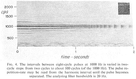
There’s been some debate in the technical literature over whether sidebands like these are a “real” phenomenon, or just an “artefact” of spectrographic analysis. For anyone interested in the debate, Watkins (1968) is required reading. If you’d like more information on where the debate went after 1968, email me. Suffice it to say that, for all intents and purposes, the winners were those who argued that sidebars were real.
Although this post was on the technical side, I hope it was useful to you. Comments are welcome (including those telling me I’ve gotten something horribly wrong).
2 thoughts on “On Spectrogram Settings”
hi Nathan, on the smoothening: there is another way, possibly more interesting than “photoshopping”. Your first “raw” spectrogram may actually give a clue. It says the windows are about 20 ms wide, but if you count the blocks there are roughly 10 in 0.1 (s) so that is more like 10 ms. Is there anything wrong? not necessarily. It just shows that the blocksize and the windowsize need not be the same. For every 20 ms time window the spectrum is plotted at the central time. Now, the difference in time between the centers of each window can be set independently. If you set it at 10 ms, subsequent windows will overlap for 50%. This seems to be the case in your raw spectrogram. You can set the overlap *much* larger if you want, because the minimum time difference between samples is a lot smaller, e.g. about 0.022 ms for 44.1kHz. A 90% overlap might lead to something similar to your smoothed spectrogram. But of course it will take about 10 times longer to compute.
Hi Willem-Pier,
You’re right…I overlooked window overlap in this post. I’ll need to correct that soon. Many thanks for the reminder!
Comments are closed.