Browsed by
Category: Spectrograms

My favorite spectrogram phone apps

My favorite spectrogram phone apps

One question I get over and over again is: which apps work best if you want to make spectrograms on your phone? I’ve got a couple of recommendations. (Note: I have no financial interest in any spectrogram app.)

Why use a spectrogram app?

Spectrogram apps are terrific because they can allow you to make a picture of a sound right when you hear it. If you are trying to identify bird sounds, a spectrogram app can show you the shape of the sound, and then you can compare that shape to the ones in the Peterson Field Guide to Bird Sounds to find a match. It turns bird sound identification into a visual challenge, which can be really advantageous since many of us have an easier time remembering visuals than sounds.

What should I look for in a spectrogram app?

There are a lot of apps out there that will generate spectrograms. If you are interested in bird sounds, here are the main features to look for:

  • The top of your display should be around 10,000 Hz (= 10 kHz). This is roughly the average upper limit of hearing in many adult humans, and it’s roughly the upper limit of most bird sounds too. If your app doesn’t top out around 10,000 Hz, look for the option to change “sample rate” or “sample frequency.” The top frequency on the display will be half the sample rate. Thus, a sample rate of 22,000 or 24,000 Hz should generate a display that is around the optimum height for bird sounds.
  • The display should scroll across about an inch of screen per second. Most apps don’t scroll this fast, so just look for one that has the fastest possible speed. If the scroll moves too slowly, the bird sounds will end up looking horizontally squished, and it will be hard to see the necessary detail.
  • The display should have a black-on-white option. The default is usually multicolor-on-black, which is not ideal. Grayscale-on-white is much easier to read, because the sound is the signal; it is the text. Text should always be dark-on-white for extended reading.
  • The display should scroll, not wrap. That is, the whole spectrogram should move across your screen from right to left, with the most recent sounds at the right.
  • You should be able to pause and screenshot the display. This allows you to “take pictures” and save them for later viewing.
  • You should be able to play back the recorded sound later. Even the worst-quality phone recordings are usually higher in resolution than phone spectrograms, so recording the sound is highly recommended.

So… which apps do I recommend, as of February 2019?

For iPhone: SpectrumView

SpectrumView for iPhone is great because it has all the above features in the free version. I don’t own an iPhone so I haven’t used it myself, but it’s highly rated and from what I can tell, does a very nice job of illustrating bird sounds.

For Android: SpectralPro Analyzer

On my Android phone, I use SpectralPro Analyzer by RadonSoft. It’s not as good as SpectrumView, but it’s the best I’ve been able to find for Android. The two big drawbacks are: 1) that it does not record audio; and 2) that key features are only available in the paid version. Last I checked the paid version was only about $5. And to work around the lack of recording ability, you can  always download a separate free audio recording app and run it at the same time as SpectralPro. That’s a little clunky, but it does the job.

If you are aware of any app that can do better than the ones I’ve listed, let me know!
The Seven Basic Tone Qualities

The Seven Basic Tone Qualities

Nothing has created more confusion about how to describe sounds than tone quality.

Tone quality is the distinctive voice of a sound — the thing that allows you to tell the difference between a violin and a trumpet when they’re both playing the same note. It comes in very handy when identifying birds by sound, but people have tended to differ in their notions of how to describe it.  Today, we’re going to break sounds down into just seven basic qualities, which in combination make up the huge variety of sounds that birds can create.

And here they are:

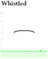
Whistled sounds

Whistles are the most basic and common type of bird sound. They appear on the spectrogram as simple nonvertical lines. Non-bird sounds with a whistled tone quality include typical human whistling, and the sounds of flutes and piccolos.  Bird examples are plentiful:

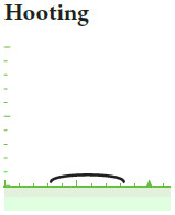
Hooting sounds

Hoots and coos are just low-pitched whistles, less than 1 kHz in frequency, that appear at the very bottom of the spectrogram. They resemble the sound made by blowing across the top of an open bottle, and they are typical of the voices of doves and large owls.

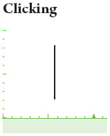
Clicking sounds

Instantaneous bursts of noise sound like clicks, pops, or taps, and appear on the spectrogram as vertical lines. The ticking of a clock, the drumming of a woodpecker’s bill against a tree, the bill snap of an angry flycatcher, and the ticking song of Yellow Rail all fall into this category.

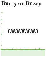
Burry and buzzy sounds

When a whistle rises and falls very rapidly in pitch, it forms a squiggly line on the spectrogram and sounds trilled, like a referee whistle. If the squiggles are tall and fast enough, they sound less musical, more like an electric buzzer. What all burrs and buzzes have in common is the presence of very rapid repeated elements, resulting in audible “beats”. This makes them very similar to (and in some cases indistinguishable from) trills.
The beats in burry and buzzy sounds are often so rapid that they are not individually visible on the spectrogram. The result is a well-defined shape on the spectrogram that is vertically thicker than the thin line of a whistle. Such sounds often have a hoarse, grating quality to the ear.

Noisy sounds

Noisy sounds contain noise—that is, random sound at multiple frequencies, which looks like television static on the spectrogram and sounds like static to the ear. Unlike buzzes, noisy sounds tend to have faded, blurry edges on the spectrogram, and they often almost stretch all the way to the bottom and the top of it.

Non-bird sources of noise include rushing streams and waterfalls, and the English speech sounds “s” and “sh”.  Noisy bird sounds tend to be described as “rough” or “harsh,” like the alarm chatters of wrens and the hissing of angry swans and geese.

Nasal sounds

Many bird sounds are actually combinations of multiple simultaneous whistles on different pitches that the human brain typically perceives as a single sound (because of the mathematical relationship between the frequencies of the different whistles). This is characteristic of the sounds we identify as having a nasal tone quality. The individual whistles are called partials.  Non-bird examples include police sirens, the whine of mosquito wings, and the sounds of oboes and violins.

Polyphonic sounds

Many birds can produce two separate sounds simultaneously, one from each lung. When birds use this ability, the two original sounds blend into one polyphonic sound. Polyphonic sounds are diverse, encompassing a number of different tone qualities, but with practice, they can be consistently distinguished from all other types of sounds by ear.

On the spectrogram, polyphonic sounds may look like nasal sounds, with stacks of partials, but if the spectrogram is high enough in quality, they can usually be distinguished by having partials that are dissimilar in shape, irregularly spaced, or simultaneously rising and falling.

The quality of most polyphonic sounds is either distinctively metallic or distinctively whiny.

metallic: If the polyphonic notes are very brief or contain monotone segments, they tend to sound metallic, like certain versions of the Hooded Oriole call, some versions the “squeaky gate hinge” songs of Brewer’s Blackbird and Common Grackle, and the shimmering melodies of thrushes like the Veery.

whiny: If the polyphonic notes do not contain any monotone segments, they tend to have a whiny quality, like the Pine Siskin and Blue-gray Gnatcatcher calls, as well as the common calls of House Finch and the flight calls of meadowlarks.

Obviously, these seven tone qualities are very broad categories. Some of them grade into one another, and some of them occur in combination — e.g., a note may be simultaneously burry, noisy, and nasal.  But this is the basic vocabulary we’ll use to start discussing the qualities of sounds.  More to come!

Changes in Speed and Pitch, and Multi-noted Series

Changes in Speed and Pitch, and Multi-noted Series

Now that we’ve looked at the five basic pitch patterns and the four basic song patterns, let’s explore a couple of ways to extend and combine the vocabulary we’ve learned.

Changes in speed

One of the basic questions we ask of any bird sound is, “are the notes slow enough to count, or too fast to count”?  Sometimes, the answer is both.

Some bird sounds change in speed. If the elements in a series are more closely spaced on the spectrogram as you move from left to right, then they are growing more closely spaced in time, which means that the series accelerates. If the elements grow farther apart, the series decelerates.

Here are a couple of examples. The song of the Wrentit is a series of notes that accelerates into a trill, while the drum of a Yellow-bellied Sapsucker starts as a trill of tapping notes, and slows into a series.

Changes in pitch

Phrases, series, warbles, and trills can also change in pitch. For example, a warble might sound upslurred if it shows an overall trend towards higher notes. Similarly, a series might fall in pitch if each note starts slightly lower than the last, even though each individual note may be upslurred.


Overslurred series are quite common among bird sounds. Here are two examples:

Changes in both speed and pitch

Many sounds change in speed and pitch at the same time. A quick glance at the spectrogram of the Sora’s whinny shows us that it’s an overslurred, decelerating series with an early peak:


Here’s a decelerating, downslurred series of upslurred whistles:

And here’s a phrase accelerating into an upslurred warble:

Multi-noted Series

Sometimes the repeated elements in a series may themselves consist of multiple notes. A two-noted series sounds like a two-syllabled word repeated, such as “peter peter peter;” a three-noted series, like a three-syllable word repeated, such as “teakettle teakettle teakettle.”

Examples of two-noted series

Examples of three-noted series

Yes, there are four-noted series too

With the basic vocabulary that I’ve introduced in these three posts, we can describe the pattern of almost any bird sound.  But there’s more to bird sounds than just pattern.  Stay tuned for the next installment in the series.

The Four Basic Song Patterns

The Four Basic Song Patterns

In the last post, I covered the five basic pitch patterns, introducing some vocabulary to help distinguish between different types of individual notes.  Today I’m going to introduce some vocabulary to help distinguish between different types of groups of notes — that is, different types of songs.

The four song patterns are based on two simple questions:

  1. Does the bird ever sing the same thing twice?
  2. Are the notes slow enough to count, or too fast to count?

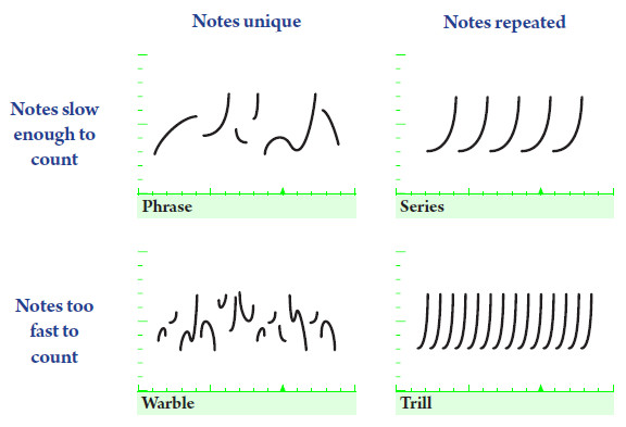
Together, these two questions delineate four basic patterns: phrases, series, warbles, and trills.  These four simple patterns, individually and in combination, give us a precise way to describe almost any type of complex bird sound.

  • Phrases are clusters of unique notes that are slow enough to count;
  • Series are clusters of repeated notes that are slow enough to count;
  • Warbles are clusters of unique notes that are too fast to count;
  • Trills are clusters of repeated notes that are too fast to count.

“Too fast to count” is a somewhat subjective criterion, but as a general rule of thumb, it’s any speed over about 8 notes per second.  Here are some examples of each pattern, so you can practice hearing the differences.

Phrases

In these examples, each note is different from the one before, and the notes are slow enough to count.

Series

In these examples, each note is the same as the one before, and the notes are slow enough to count.

Warbles

In these examples, the notes are all different, and too fast to count.

Trills

In these examples, the notes are all the same, and too fast to count.

In the next installment in this series, we’ll look at some ways to combine and extend this vocabulary to cover almost any type of bird sound pattern.

The Visual Power of GIFs

The Visual Power of GIFs

Animated GIF: quintessential genre of the modern internet.  A good proportion of the web is devoted to these short, silent looping video clips, mostly in the service of slapstick humor.  But GIFs have significant educational potential as well, especially when it comes to the visualization of patterns — which is what this whole website is all about.

Visualizing variety

Ornithologists use the term variety to describe the pattern of delivery of a bird song over time.  Some individual birds sing only a single song over and over (no variety).  A bird that can sing multiple songs might choose to sing one for a while before switching (eventual variety), or it might switch constantly (immediate variety).

In the field, it can take many minutes of listening to determine a bird’s pattern.  Animated GIFs of spectrograms can condense all this listening into just a few seconds of looping video:

Olive-sided Flycatcher

Carolina Chickadee

Hermit Thrush
No variety
(all songs
identical)
Eventual variety
(songtypes repeated several
times before switching)
Immediate variety
(consecutive songtypes
always different)

In each GIF above, the spectrogram of a single bird song appears on the screen for one fifth of a second. It is then replaced by the spectrogram of the next song by the same bird.  After a couple dozen songs, the animation loops back to the beginning.

Seeing song similarities (and differences)

As all naturalists know, the pieces of nature rarely fit into neat categories — and so it’s no surprise that the three categories of variety above are inadequate for describing the more complex patterns of variation found in many bird songs.  A GIF, though, might be up to the task.

Take these 18 songs from a Vesper Sparrow:

Vesper Sparrow, Montezuma County, CO, 5/11/2008.

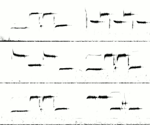
Note that the level of variety at the beginning of each song is completely different from the level of variety at the end.  Each song starts with the same 3 (rarely 4) downslurred whistles, followed by the same rapid series of vertical notes (the number varying from 5 to 7).  After that, variety increases dramatically.  The middle section irregularly alternates between two different patterns, and the ending switches even more frequently, between at least three different motifs.

This type of cascading variety is typical of Vesper Sparrows.  The opening notes tend to vary little within an individual, but by the end of the song, variation is tremendous.  Perhaps this allows the sparrows to “have it both ways” — that is, to simultaneously send two conflicting messages to the listener.  The stereotyped opening satisfies their need to identify themselves unambiguously to a potential mate or rival (“I am a typical Vesper Sparrow!”), while the jazzy ending allows them to show off their improvisational virtuosity (“I’m not your ordinary Vesper Sparrow!”).

I’m fascinated by the potential for GIF visualization… perhaps you’ll see more animated spectrograms on this blog in the future.

A Veery’s Two Voices

A Veery’s Two Voices

Veery, York County, Pennsylvania, 15 June 2007. Photo by Henry McLin (CC 2.0).

As a kid, I began learning to identify bird sounds by listening to the old Peterson Birding By Ear tapes (one of the best learning aids in existence for bird song, still on the market in CD form).  One part of the tape eventually wore through because I listened to it so often — the part with the Veery.

What made that part so special was that Birding By Ear played the Veery song several times — first at normal speed, and then slowed down to half and quarter speed. At full speed, the song was incredible: a shimmering swirl of notes spiralling downward, ethereal and metallic.  Slowed down, it was more incredible still. The bird’s voice rolled up and down arpeggios like someone playing pan pipes — two people playing pan pipes, actually, because the Veery is a polyphonic singer; it sings simultaneously with both sides of its syrinx.  The bird literally has two voices, one from each of its lungs, and it can control them separately. A single Veery sings a duet — and when you slow the song down, you can hear the bird actually harmonize with itself.

Today, I can recreate those slowed-down Veery songs on the computer.  And I can take it one step further: I can undo the duet.  I can edit the sound file so as to listen to one Veery voice at a time.

 The original

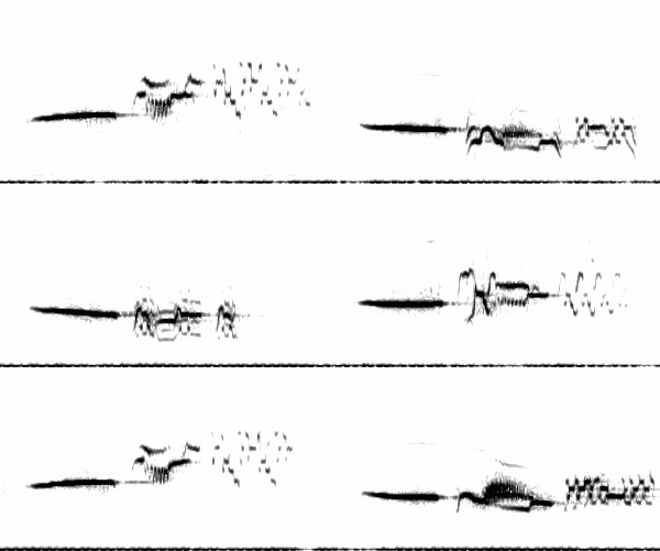
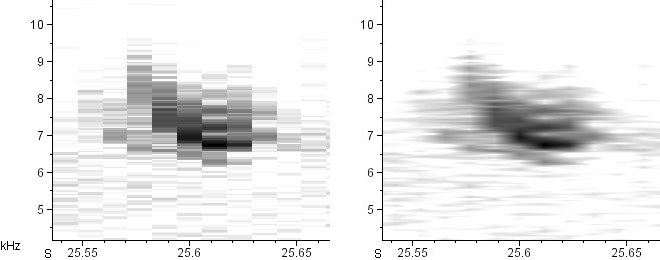
Here’s one strophe of a Veery song from Colorado. I’ve cleaned up the spectrogram to show how the two voices overlay one another. (Not my best photo editing, but it’ll have to do.)

Veery song, Jackson County, Colorado, 25 June 2007. Recording by Andrew Spencer

If you’re familiar with the Veery’s song from the eastern United States, you might find this example slightly less ethereal, slightly more jangling, and slightly less shimmery than the versions you’re used to hearing.  For the most part, that’s not actually due to geographic differences in Veery song (although there are some of those as well).  It’s mostly due to the fact that eastern Veeries almost always sing in hardwood forests, where their voices bounce off of innumerable trunks and leaves, smearing the sound with echo.  The Veery I’ve chosen, like most in Colorado, sings in willow carrs at medium-high elevation — a much more open habitat that lacks a forest’s echo.  It may make the Veery a little less evocative, but it makes it much easier for me to do the sound editing necessary to separate the voices from one another.

Now let’s slow the Veery down, so you can hear it harmonizing with itself:

half speed:

1/4 speed:

Separating the voices

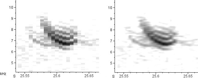
Here’s what the spectrogram of the Veery song looks like if we make the two voices different colors:

Same Veery spectrogram, with the upper voice colored red and the lower voice colored cyan.

And here they are, separated to the best of my ability. (The first note, the rising single-voiced burr, is on both recordings.)

Upper voice (red):

Lower voice (cyan):

Having trouble following along?  Try listening to both voices at half speed:

Upper voice (red) at half speed:

Lower voice (cyan) at half speed:

What can we learn from this exercise?  First, the upper voice dominates the original song.  It’s carrying the melody; the lower voice is softer and just provides the harmony.  Second, the level of detail in each voice is immense, and can be difficult to follow even at half speed.  Third, both voices are needed to bring out the jangling, metallic quality that is so typical of Veery and its relatives. That metallic sound is an emergent property of the two voices mixing.  More on that in a future post.

Finally, and most importantly: bird sounds are really, really freakin’ cool.  But I bet most of you knew that already.

The Beauty of Spectrograms

The Beauty of Spectrograms

I do not count heards. To tick an antpitta is to see one well, otherwise we would have t-shirts with pictures of sonographs.

Iain Campbell

Long before my Earbirding co-author Andrew Spencer went to work for Iain Campbell at Tropical Birding, Andrew introduced me to Iain’s infamous quote about heard-only birds.  Being audio fanatics, Andrew and I had a good laugh about it, and resolved to make spectrogram shirts just to spite him.

Someday I will get around to making a T-shirt with a spectrogram on it.  But when I do, it won’t be to spite Iain Campbell.  Nor will it be to champion the counting of “heards.”   (That battle is winning itself — today’s birders are increasingly satisfied with other ways of encountering a bird besides simply laying eyes on feathers.)

When I finally make a spectrogram shirt, it’ll be to celebrate the striking beauty of bird sounds.

Spectrograms are the calligraphy of the natural world.  A spectrogram is text, not in metaphor but in fact.  As the written representation of an oral communication, a spectrogram is every bit as valid a text as the words on this page.  The lines and curves that make up this sentence are standing in for sounds, as do the lines and the curves in a spectrogram — and in both cases, each line and curve carries meaning to those who speak the language in which the text was composed.  The correspondence goes beyond the semantic and into the artistic.  Some spectrograms match human calligraphy flourish-for-flourish in intricacy, tension, balance, and grace.

The "Bismillah," one of the most famous Quranic texts for calligraphy: "bismi-llahi 'r-rahmani 'r-rahim", "'In the name of God, the most gracious, the most merciful." Remixed from photo by Swamibu (Creative Commons 2.0).
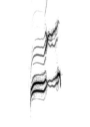
Spectrogram of Ruby-crowned Kinglet song, Larimer County, CO, 6/1/2008.

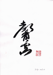
Just as each calligrapher’s work displays its own style, each vocalizing bird traces an individually unique spectrogram when it sings — its own personal signature in sound, the result of a fleeting, even if repeated, intersection of communicator, medium, and meaning.  As the Wikipedia entry on Shodo (Japanese calligraphy) puts it, “For any particular piece of paper, the calligrapher has but one chance to create with the brush. … The brush writes a statement about the calligrapher at a moment in time.”  In the same way, the spectrogram writes a statement about a bird at the moment it utters a sound.

Shodo (Japanese calligraphy) meaning "intoxicating fragrance," by sensei @ sanbokyodan (Creative Commons 2.0).

Brewer's Blackbird song, Tule Lake NWR, CA, 5/12/2002. Recording by Geoff Keller (LNS 120233). Click to listen

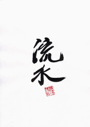
Shodo (Japanese calligraphy) meaning "water bed," by sensei @ sanbokyodan (Creative Commons 2.0).

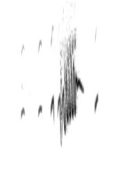
Dusky Flycatcher trill call, Sierra County, CA, 6/2/1992. Recording by Randolph Little (ML 99326). Click to listen

To celebrate the beauty of spectrograms, I’ve multiplied the images in the header of this blog.  Fans of the original Bobolink header need not worry — it’s still in the rotation — but now it’s been joined by seven other spectacular “specs” celebrating a wide variety of bird sounds from different families.  One of these eight headers will load at random each time you land on the page.  I’ve updated the “Headers” page to reflect this new diversity.  If you enjoy them half as much as I do, you might get stuck here hitting “refresh” for hours.

I’ll leave you with two final masterful examples of graphic design, one by a bird and one by a human.  I’ll let you sort out which is which.

Arabic calligraphy from a photo by Dr Case (Creative Commons 2.0), remixed with Western Meadowlark flight song, Pueblo County, CO, 5/13/2011.
Recyclers

Recyclers

Northern Mockingbird, Val Verde County, TX, 4/30/2010. Photo by Matthew High (Creative Commons 2.0)

“Mockingbirds are among the world’s most inspired mimics,” writes composer Andrew May.  “They learn to imitate other birds’ songs (and other sounds) and incorporate them into their song. Humans, too, imitate and recycle the sounds we hear into our own songs and stories; technologies for recording and manipulating sound have made us even more avid recyclers.”

I like thinking of mockingbirds and other birds that imitate as “recyclers” rather than “mimics,” and so do some biologists.  It’s been argued that using the term “mimics” to describe mockingbirds is misleading, because in most branches of biology, “mimics” are organisms that take on or use the characteristics of other organisms in order to be mistaken for them.  The palatable Viceroy butterfly, for example, profits from its similarity to the poisonous Monarch only if predatory birds can’t tell the difference.  It may not be clear why a mockingbird chooses to belt out the song of a Carolina Wren, but everybody agrees that it isn’t trying to pass itself off as a wren; more likely its motives are closer to those of a human hip-hop artist who creates remixed songs entirely from samples.  It’s not mimicking, it’s “appropriating,” to use biologists’ favored term — or “recycling,” to use Andrew May’s analogy.

But May is not content merely to comment on the artistic motives of mockingbirds.  He has turned the tables on the mockingbird and “recycled” its already-remixed song into an artistic statement of his own.

May, an associate professor of music at the University of North Texas,  has composed a piece of avant-garde classical music called “Recyclers” that centers on a recording of a Northern Mockingbird that I made in Big Bend National Park in 2007.  I had forgotten that I gave him permission to use the recording until recently, when I stumbled across his website devoted to the composition.  I’m quite taken with it.

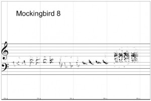
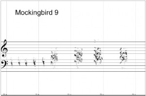
The part of the piece I find most fascinating is that May didn’t even use traditional musical notation.  Instead he overlaid a spectrogram of the mockingbirds’ song directly onto the musical staff:

I’ve often felt that my own musical training was very helpful in learning to read spectrograms, and I’ve seen people use spectrograms of bird songs to recreate them in musical notation, but this is the first time I’ve seen anyone merge spectrograms and musical notation in this way.

In a live performance, the slowed-down mockingbird sings along on a digital recording while the performers attempt to imitate it, using their ears and their interpretation of the unorthodox score as a guide.  It’s not Beethoven, and those unaccustomed to modern classical music may find it unappealing.  But I, personally, enjoy it quite a bit.  You can listen to a 25-minute performance by the Nova Ensemble below:

As May points out,

The performance may happen anywhere – a concert hall is not necessarily the best environment. Outdoor spaces (especially those populated with mockingbirds) are encouraged.

Wouldn’t it be wonderful to hear a chamber orchestra inviting the local mockingbird population into a joint performance?  Unfortunately, the slowed-down playback of the bird sound in May’s recording means it’s unlikely to get a mockingbird’s attention even if performed outdoors — they won’t recognize it as mockingbird song.  But knowing mockingbirds, it might not matter.  Perhaps they’ll learn something, and repeat a piece of May’s mockingbird-inspired music long after the chamber orchestra is gone.

Spectrograms on the iPhone

Spectrograms on the iPhone

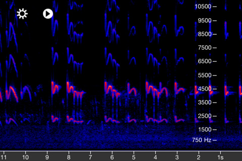
Screenshot of the Spectrogram application for iPhone, showing how it renders Killdeer vocalizations. Click for link.

An email from Denise Wight alerted me to the Spectrogram application for the iPhone, which is a pretty neat little app indeed.  It uses the iPhone’s built-in microphone to create realtime scrolling spectrograms of any sound you’re hearing.  This means you can see spectrograms in the field, at the very same time that you’re listening to the bird sound.

Why is this exciting?  Because now those with hearing loss can see the sounds that their ears can’t hear!

Here’s an example.  Ted Floyd, editor of Birding magazine and author of the Smithsonian Guide to Birds, is Colorado’s recognized guru of nocturnal migration study.  Ted and I have gone out together many times to listen to nocturnal migrants giving their quiet “seep” and “tsit” notes high overhead in the dark, and every experience has been frustrating for me, because Ted invariably hears ten times more flight calls than I do, and that’s no exaggeration. My ears simply aren’t good enough to register such high-pitched sounds at such low volume.  I can only hear the lowest, loudest migrants, and for a while I suspected Ted might be making up the rest.

No such luck.  I realized the phantom flight calls were real when I carted my laptop into the field, plugged my shotgun microphone into it, and started recording with Raven.  Voila: a realtime scrolling spectrogram showed me the sounds of the night sky, even the ones I couldn’t hear.  The scrolling spectrogram gave me a chance to identify sounds visually that I couldn’t even detect by ear.

Now anyone with an iPhone can have the same experience, for the low price of $4.99, without having to lug a laptop and a microphone into the field.

The Spectrogram application has its pros and cons.  The gain is adjustable, which is nice.  You can adjust the frequency scale to run from zero to 8 kHz, 22 kHz, or 44 kHz — the 8 kHz setting should work best for most bird sounds — but you can’t zoom in or out on the time scale, which means those flight calls aren’t likely to be visually identifiable.  This may be better in future versions.

One thing that drives me absolutely nuts is the color scheme.  You can’t change it to grayscale — you’re stuck in the odd red-and-blue mode.  Personally, I can’t stand spectrograms in colors.  They may be nice for other purposes, but when it comes to identifying bird sounds, the colors get in the way.  Birders don’t need much information about loudness; for us, a spectrogram is text, and it’s meant to be read.  Therefore it needs to be in black and white, for the same reason that books need to be printed in black and white — anything else hurts the eyes after a while.

I could say more, but I’ll dismount my soapbox. Before signing off I should note that Pete Schwamb, the creator of Spectrogram for the iPhone, has also created a couple of other cool audio-related iPhone apps — including CricketSong, which uses the chirping of Snowy Tree Crickets to determine the air temperature.  Check it out.

On Spectrogram Settings

On Spectrogram Settings

Today’s post is the promised follow-up to my post on the history of spectrograms. I want to explain some basic concepts of spectrographic analysis so that I can clear up some common misconceptions and explain why some things may not always look quite the way you expected.

In “A Brief History of Spectrograms” I mentioned that the original Kay Electric Co. Sona-Graph had two settings: narrow-band and wide-band. Nowadays, spectrograms are produced from digital recordings on computer software that allows much more control over the width of the “band.” But our control over how spectrograms look isn’t complete, and here’s why.

The Trade-off: Frequency Resolution vs. Time Resolution

The first thing every student of spectrograms should understand is that the more accurately you measure the frequency of a sound, the less accurately you can know when it begins and ends – and vice versa. The reason for this is a fundamental part of the mathematics behind our spectrographic analysis, and I won’t attempt to explain it here.

The main effect of this principle is that modern spectrograms are broken up into small rectangles called “windows” which are the basic “pixels” of the image. As anyone familar with digital images knows, tiny pixels make for a sharp, clear image, and big pixels make for a blocky, poorly defined image. Unfortunately, spectrographic windows are necessarily rather big and blocky. You can shorten them in one dimension, but if you do, they automatically get longer in the other dimension. Depending on your settings, you can end up with “pixels” that are long, thin rectangles, instead of squares.

Modern spectrographic analysis software generates these “windows” behind the scenes and then automatically “smooths” the resulting spectrograms so that they seem to have higher resolution than they actually do. This smoothing algorithm is basically an after-the-fact Photoshop trick, and although it’s very helpful in making visual sense of a spectrogram, it’s important to realize that the smoothing doesn’t actually increase the amount of information in the spectrogram; it’s just the computer’s best guess at what the spectrogram would look like if the resolution were higher.

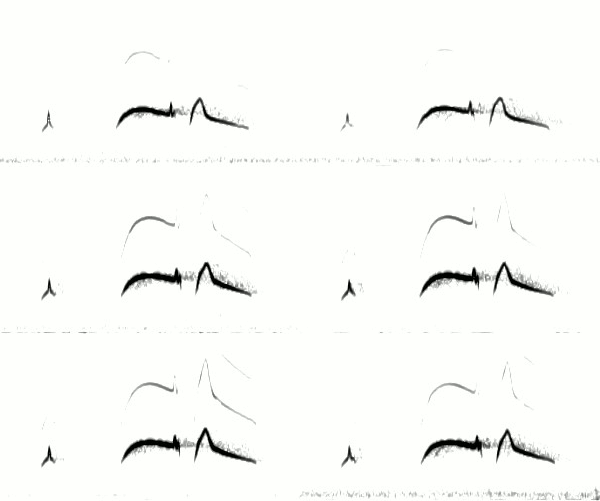
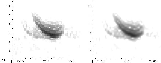
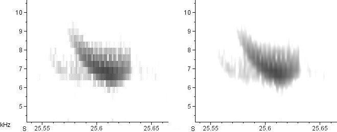
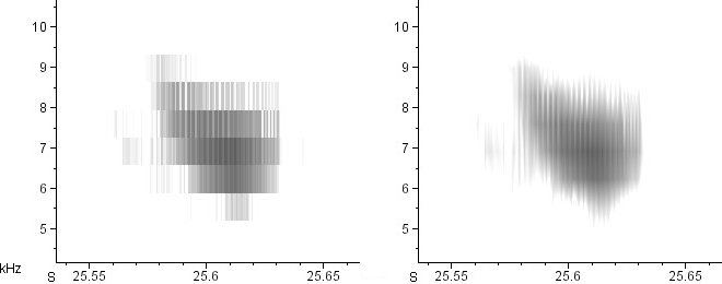
Here’s a series of spectrograms of the exact same recording (an American Tree Sparrow call). On the left is the raw, unsmoothed spectrogram. On the right is the smoothed version. From top to bottom, the time resolution increases and the the frequency resolution decreases.

Window size: 23.2 mS × 61.9 Hz

American Tree Sparrow call, Minnehaha County, SD, 12/13/2009.  Left: raw (unsmoothed) spectrogram; right: smoothed version.
American Tree Sparrow call, Minnehaha County, SD, 12/13/2009. Left: raw; right: smoothed.

Window size: 11.6 mS × 124 Hz

Same recording.
Same recording as above. Left: raw; right: smoothed.

Window size: 5.8 mS × 248 Hz

Same recording as above.
Same recording as above. Left: raw; right: smoothed.

Window size: 2.9 mS × 496 Hz

Same recording as above.
Same recording as above. Left: raw; right: smoothed.

Window size: 1.45 mS × 991 Hz

Same recording as above.
Same recording as above. Left: raw; right: smoothed.

Note that I am not “zooming” in or out on these calls; the time and frequency axes remain precisely the same in all of the above spectrograms.  All I’ve done is decrease the width of the analysis windows, which automatically increases their height.

See how tremendously different the smoothed spectrograms look from one another?  The difference between the second and fifth is particularly striking.  In the second, we clearly see a series of horizontal sidebands in the call.  In the fifth, we see only an extremely rapid series of vertical, click-like notes.  How can these possibly be spectrograms of the same call?  Which one is right?

They’re both right.  All the spectrograms above are accurate, in that they’re all displaying different (accurate) interpretations of the same data.  A complex tone comprised of whistled partials (like in the second spectrogram) and a rapid series of clicks (like in the fifth spectrogram) can be the same sound.  Once a series of clicks becomes fast enough, we hear it as a harmonically complex tone.  This shouldn’t be surprising when you consider that the human vocal cords are just making a series of very fast clicks, but the result is a wonderfully rich, harmonically complex sound: the human voice.

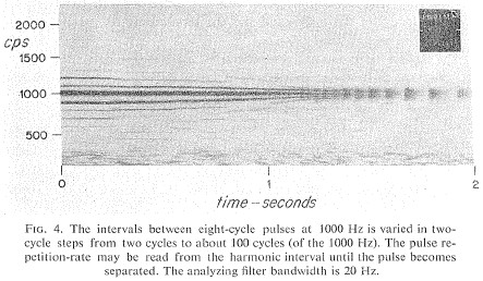
Here’s a spectrogram that shows basically the same phenomenon.  Artificially generated for demonstration purposes, it’s the spectrogram of a decelerating series of groups of clicks.  When the groups of clicks are closely spaced, at the beginning of the spectrogram, they don’t show up as groups of clicks, but as a single pure tone with sidebands.  Only later, when the distance between clicks reaches a certain threshold determined by the window size, does the spectrogram begin to resolve them separately:

caption
From Watkins (1968).

There’s been some debate in the technical literature over whether sidebands like these are a “real” phenomenon, or just an “artefact” of spectrographic analysis.  For anyone interested in the debate, Watkins (1968) is required reading.  If you’d like more information on where the debate went after 1968, email me.  Suffice it to say that, for all intents and purposes, the winners were those who argued that sidebars were real.

Although this post was on the technical side, I hope it was useful to you.  Comments are welcome (including those telling me I’ve gotten something horribly wrong).