The Visual Power of GIFs
Animated GIF: quintessential genre of the modern internet. A good proportion of the web is devoted to these short, silent looping video clips, mostly in the service of slapstick humor. But GIFs have significant educational potential as well, especially when it comes to the visualization of patterns — which is what this whole website is all about.
Visualizing variety
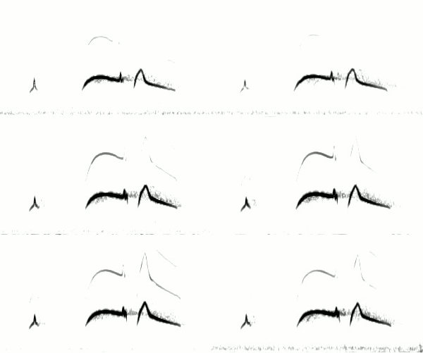
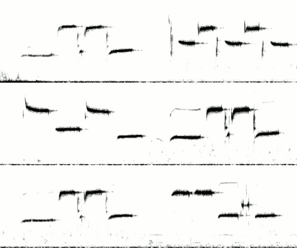
Ornithologists use the term variety to describe the pattern of delivery of a bird song over time. Some individual birds sing only a single song over and over (no variety). A bird that can sing multiple songs might choose to sing one for a while before switching (eventual variety), or it might switch constantly (immediate variety).
In the field, it can take many minutes of listening to determine a bird’s pattern. Animated GIFs of spectrograms can condense all this listening into just a few seconds of looping video:
| No variety (all songs identical) |
Eventual variety (songtypes repeated several times before switching) |
Immediate variety (consecutive songtypes always different) |
In each GIF above, the spectrogram of a single bird song appears on the screen for one fifth of a second. It is then replaced by the spectrogram of the next song by the same bird. After a couple dozen songs, the animation loops back to the beginning.
Seeing song similarities (and differences)
As all naturalists know, the pieces of nature rarely fit into neat categories — and so it’s no surprise that the three categories of variety above are inadequate for describing the more complex patterns of variation found in many bird songs. A GIF, though, might be up to the task.
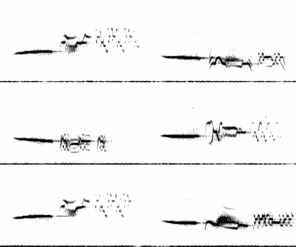
Take these 18 songs from a Vesper Sparrow:

Note that the level of variety at the beginning of each song is completely different from the level of variety at the end. Each song starts with the same 3 (rarely 4) downslurred whistles, followed by the same rapid series of vertical notes (the number varying from 5 to 7). After that, variety increases dramatically. The middle section irregularly alternates between two different patterns, and the ending switches even more frequently, between at least three different motifs.
This type of cascading variety is typical of Vesper Sparrows. The opening notes tend to vary little within an individual, but by the end of the song, variation is tremendous. Perhaps this allows the sparrows to “have it both ways” — that is, to simultaneously send two conflicting messages to the listener. The stereotyped opening satisfies their need to identify themselves unambiguously to a potential mate or rival (“I am a typical Vesper Sparrow!”), while the jazzy ending allows them to show off their improvisational virtuosity (“I’m not your ordinary Vesper Sparrow!”).
I’m fascinated by the potential for GIF visualization… perhaps you’ll see more animated spectrograms on this blog in the future.


9 thoughts on “The Visual Power of GIFs”
How do you make them? Software? Website?
I made them using the GIMP (free graphics editing software). I took screenshots of each song, then loaded each image as a layer in a single GIMP project. Then I just exported it in GIF format and clicked the box that said “loop forever.” Easy!
Very interesting and cool Nathan!
Cool!
I wonder if it would be useful (if possible) to color code each individual song, or maybe more useful to color code the sections (intro = purple, mid = blue, ending = red). Just thinking out loud!
Yes, that would be possible, Madeline. I can experiment with colors if I can find the time.
of course, it would be even cooler to write some software that could recognize individual song strophes and generate these automatically. Generating them manually seems like a lot of work. But I don’t think I have the skills to do such a thing.
Nathan,
This is a brilliant idea. I feel so lucky to have stumbled by your site while this discussion is going on. I see great potential for this technique. Not only does it show the three kinds of variety, but also higher order pattern, such as the pitch alternation of song-types by the Hermit Thrush. (Might this not show up more dramatically if the sonograms were plotted on a log scale. I really wonder if those of us interested in using sonograms to augment aural memory might not be better off using log-scaled y axes.) And then, something I never realized without the aid of your gif, every one of those Hermit Thrush songs begins at the same frequency. There also seems to be something regular going on with the fine structure of the chickadee songs, and maybe ever the flycatcher. And color-coding phrase-types is a good idea. The pattern in the Lark Sparrow is so different from that of the Vesper Sparrow. If you color-coded Lark Sparrow songs the phrases would be dancing all around as they switched positions with each song.
Thanks very much for working this up.
Arch,
Isn’t it cool that all the Hermit Thrush whistles start in the same place? I never would have guessed it.
I originally tried this technique with some more complex songs, like those of Pacific Wren, and decided they got too confusing, because the same phrase types were shifted too far left or right in consecutive songs. Color-coding might help make sense of the complexity. I’ll have to play around with it when I have the time.
Nathan, If the spectrogram data were digitized (like frequency * time like a time series), it could be analyzed by statistical software like S-Plus/R, with a color assigned to each series. Then resulting plots would be in color and you could make screen shots and process them in the same way as for the above GIFs. The visualizations would be awesome!
Comments are closed.